ADP is an industry-leader in online payroll and HR solutions, plus tax, compliance, benefit administration and more. I was a UX intern at ADP (Alpharetta, Georgia) for the summer of 2018; part of the ADP Workforce Now team - a web-based human resources (HR) application designed especially for midsize businesses. I worked on different projects within Payroll Innovation (PI), a cutting edge redesign of the current payroll experience that aimed to redefine the entire end to end payroll process by enabling all functions of the process in a robust, easy to use and interoperable manner. My role involved UX design, interaction & visual design, research and information architecture work.
Payroll administrators need to set the payroll schedule for the upcoming year for their company by the last quarter of the previous year. This is a surprisingly complex task, as companies have complicated payroll setups and payroll practitioners have been using the same legacy system for decades. Payroll is a sensitive process - after all, nobody would want anything to happen to their paycheck!
I designed a solution for payroll admins to have an intuitive and easy to use way of reviewing the payroll schedules in a timely manner, make any changes as required, and have a clear, high level view of any and all changes made.
Designing micro interactions and applying principles of motion design helped in introducing new methods of prototyping for the team
Using my engineering background helped in negotiating trade-offs and getting stakeholders aligned across engineering and product
Rapid, Agile design iterations helped in reacting quickly to the research and testing insights as I came across them
Applied my enterprise experience to redesign legacy software in a B2B domain while adhering to user mental models
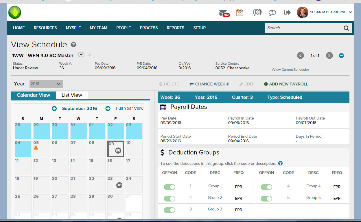
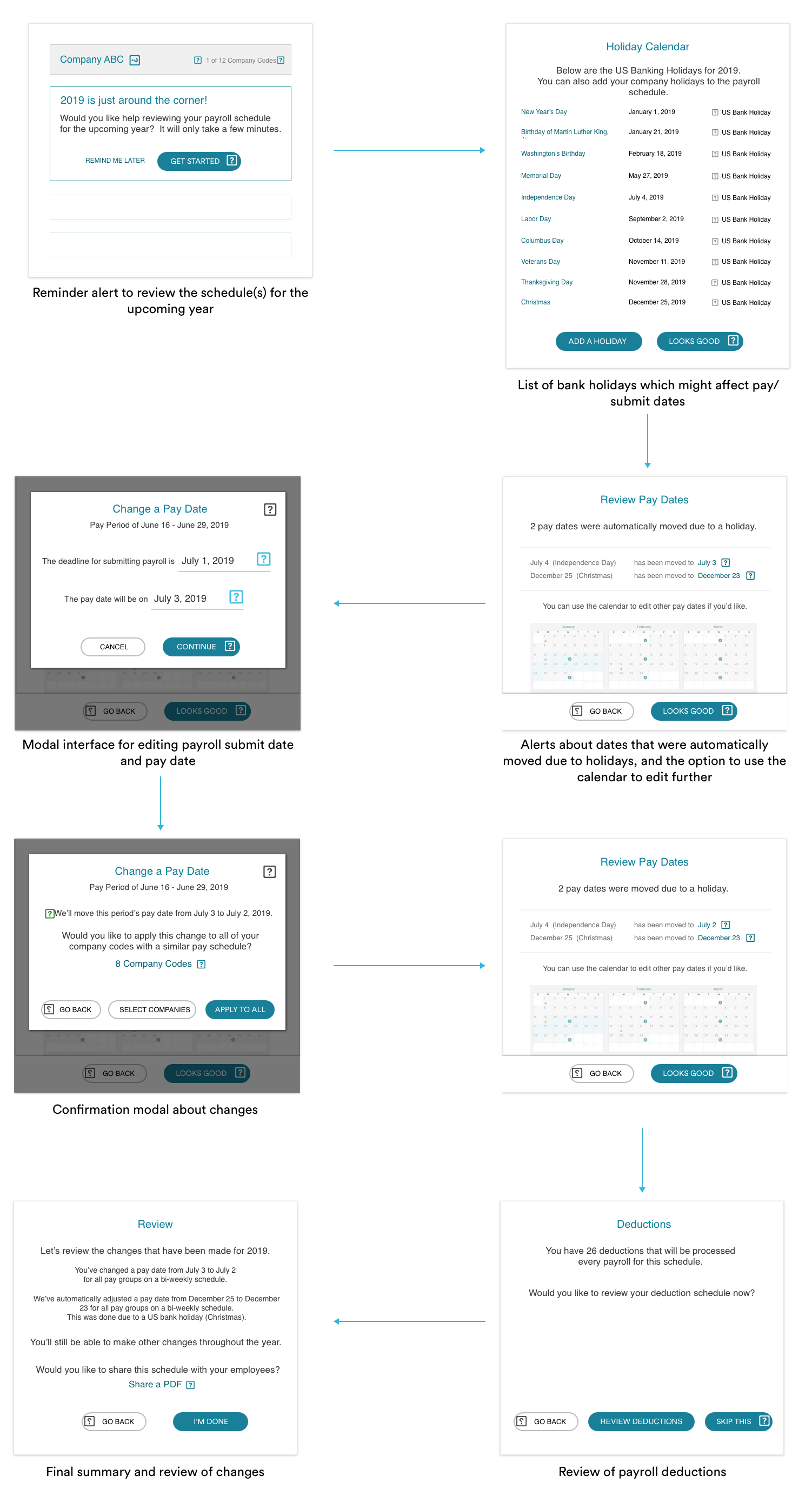
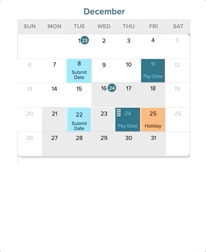
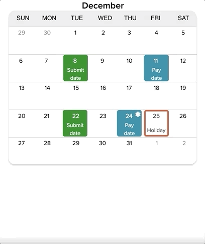
This is an annual review process where the entire payroll schedule for the next year is reviewed. Payroll admins receive an alert on the system to review the upcoming schedule around the end of the previous year. The submit date is when the payroll is submitted, and pay date is when it is actually paid out to the employees in the company. There are different pay frequencies - weekly, biweekly, monthly and so on. Bank holidays can have an effect on the dates - and there is a minimum processing time between submitting the payroll and the employees actually seeing the money in their account.
At a high level, I aimed to answer the below questions through the design.
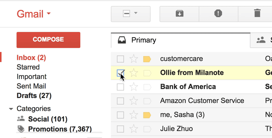
We interviewed payroll admins about their schedule processes and they stepped through the wireframes flow shown below.
Users really liked the calendar view and wanted to be able to edit the dates directly in that view
While holiday conflicts were a concern, users were not concerned with the explicit list of holidays
Every user had their own methods of saving the calendar for reference - some liked to print & distribute them
We used patterns from ADP's design library - called VDL - to do an initial pass at the flow based on the insights from our user research, and tested them extensively with 7 of our customers, iterating several times over.
We designed the alert banner for the payroll practitioner for them to either take action immediately or click 'Remind me later'.

From our testing, the message was “straightforward” and easy to understand, but the banner blended into the background - and users wondered when the banner would pop up again if they hit 'Remind me later'.
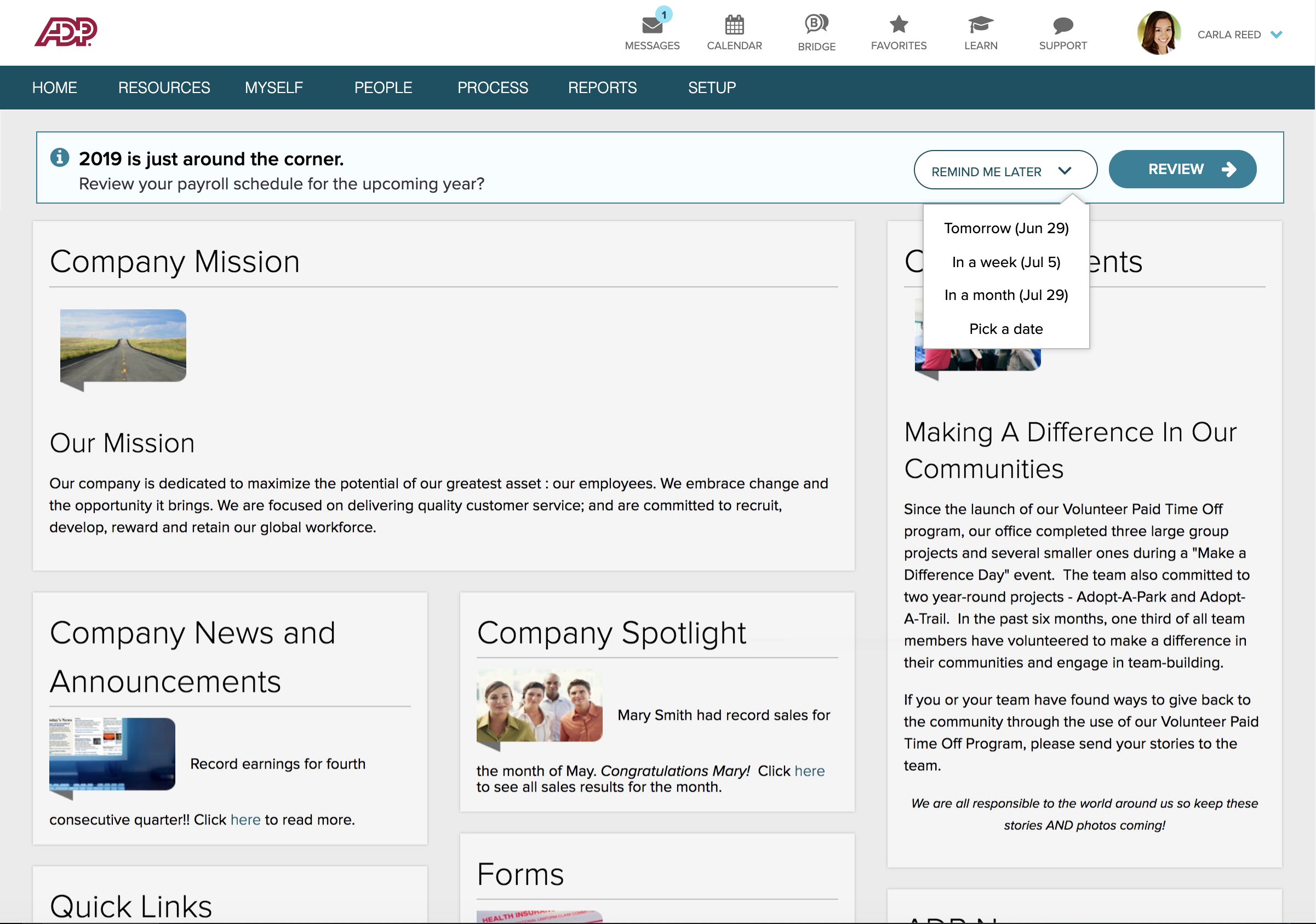
This iteration of the banner drew the user's attention immediately, and it was clear when the banner would resurface if the user clicked 'Remind me later'. However some users did note that they see several messages, and it might get lost in a noisy environment - hence it was decided to also provide email notifications as required to the right practitioner.
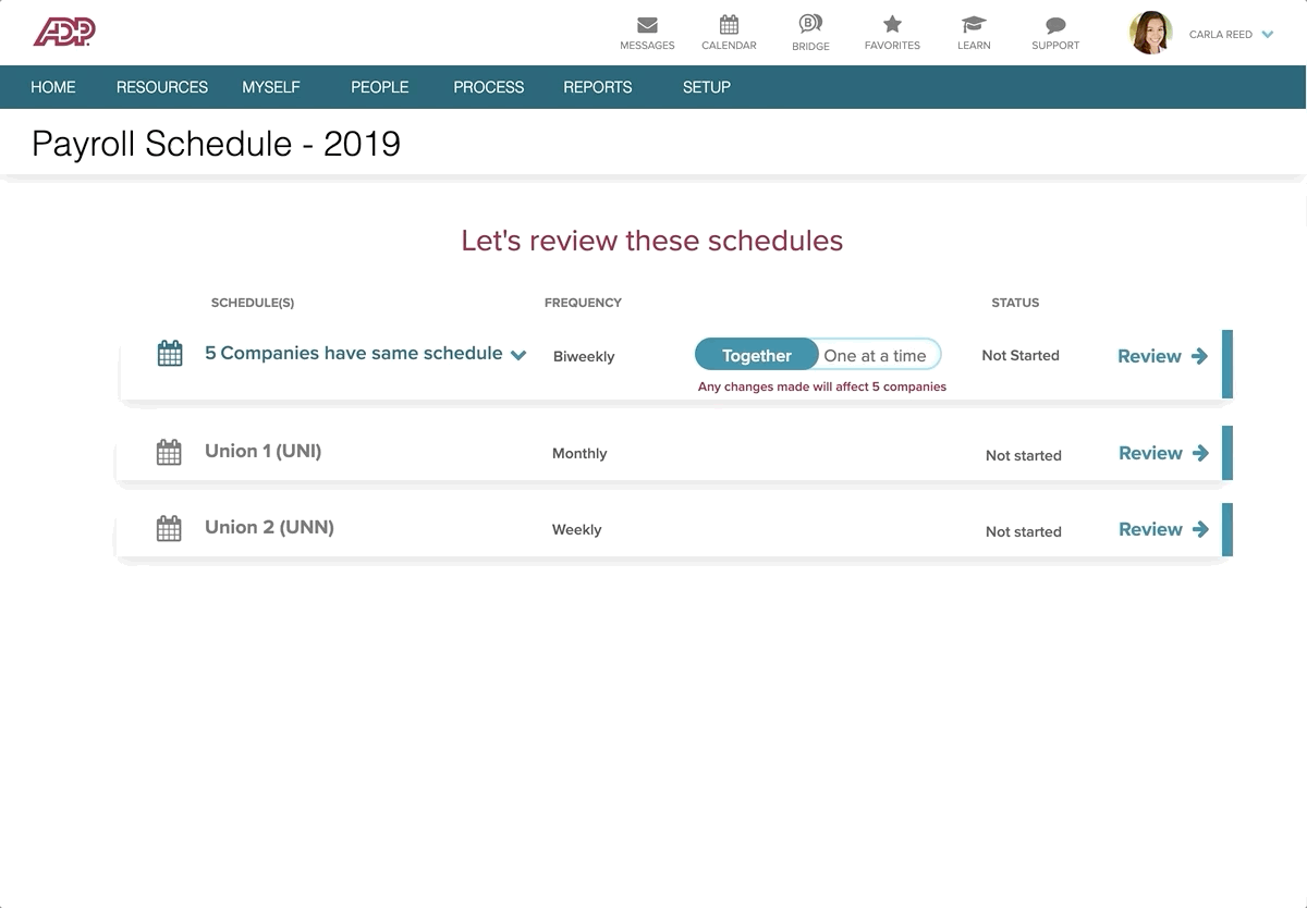
The tricky part about reviewing the payroll schedule is that there can be multiple schedules and multiple companies that a practitioner has to review.
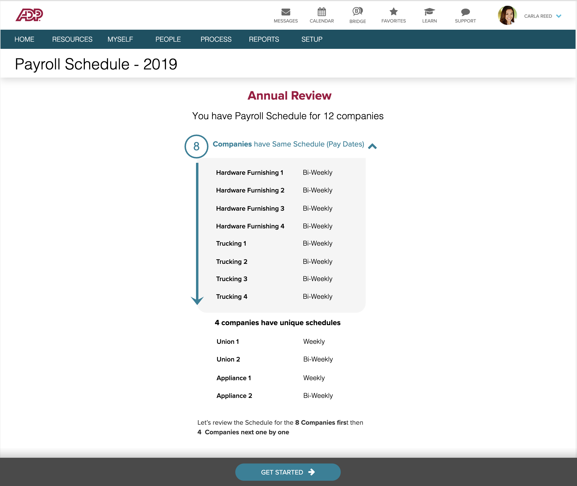
At first, we combined all the companies that a user has to review that have the same schedule together. This takes a wizard step by step approach where the user reviews them one after the other. During our testing however, we found that users would not want to be forced to go down a specific order of reviewing the schedules - especially since multiple practitioners might be handling the different company schedules.
Users appreciated being able to review multiple company codes together, but also the option to review one at a time if needed (especially if there are multiple practitioners handling multiple codes), and “One at a time” worked exactly as they expected.
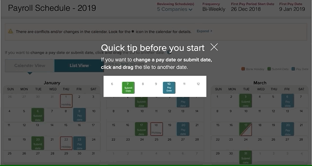
Users needed to easily move around dates in case of changes. Since the calendar had tested well in our initial sessions, due to the visual representation of their schedule, we wanted them to be able to change the dates directly on the calendar page by dragging and dropping the tiles as needed.
The challenge then was - how does a user know something is draggable unless they drag it? How does a user know some action happens on hover unless they hover over the object?
Visual cues and known patterns
I used the drop handle, drop shadow and an alert to indicate the date change functionality. Users really liked the drag/drop functionality, but only 1 out of the 7 we tested with knew that the six dots indicated the date tile was movable. They didn't read the alert message which gave a tip as it was lost in the noise.
I designed a guide/overlay to show a quick tip through an animation that I had made in Principle. This tested very well with users, with all of them understanding exactly what it was right away without it causing friction in their process. I removed the six dots (drag handle), and iterated on the drop shadow, drop target as well as the 'snapping' effect on drop. Participants were often impressed or excited about being able to drag and drop to change dates.
The director of design was impressed with this experience, and I documented the process for the team to replicate it in other areas of the product where applicable.
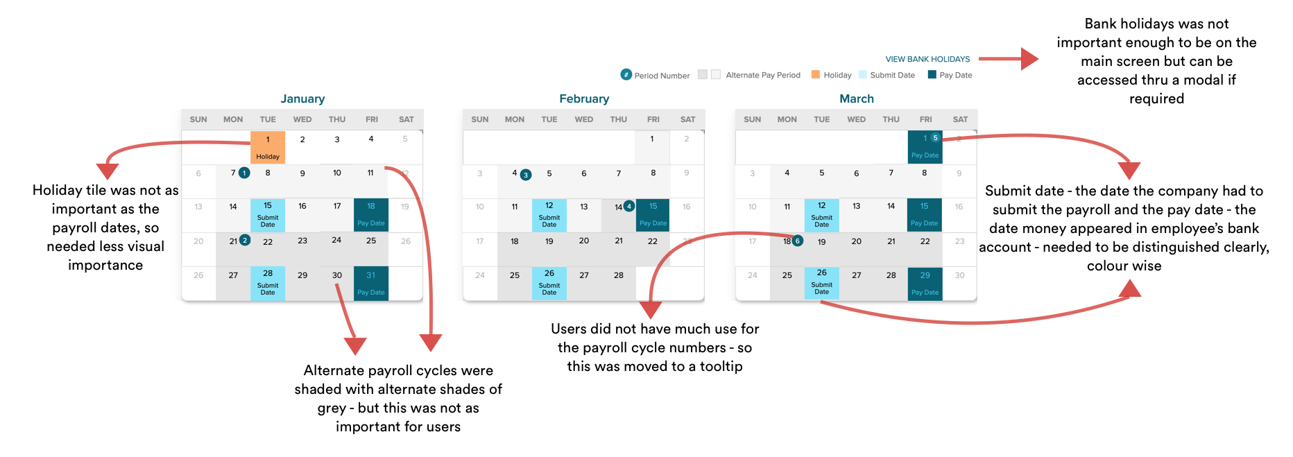
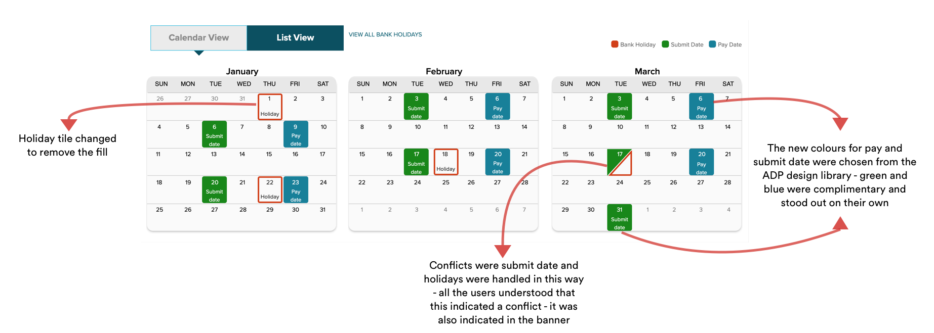
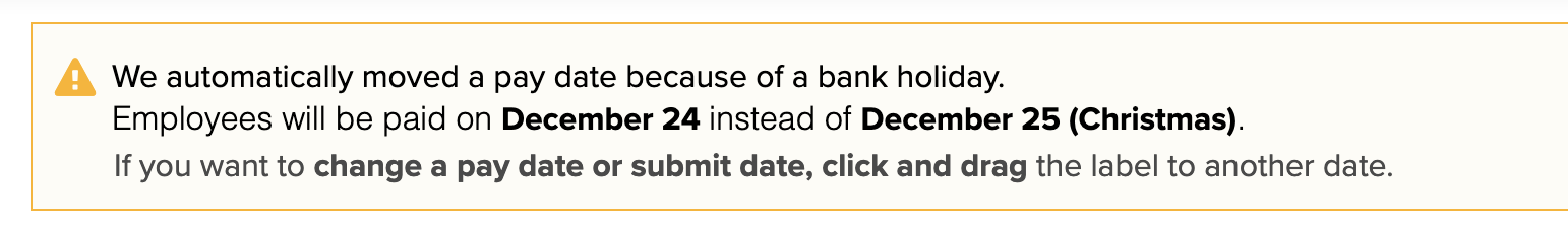
Pay dates - when the money is actually transferred to the employee's account - are automatically moved in case of a conflict with bank holidays.
Changes made automatically by the system were conveyed through an alert banner. While this provided a necessary summary of changes - users often skipped reading it at first. How might we then contextualize this information within the page?
We kept the banner as an overview of any changes made by the system - but also indicated the changes through icons on the tiles themselves.
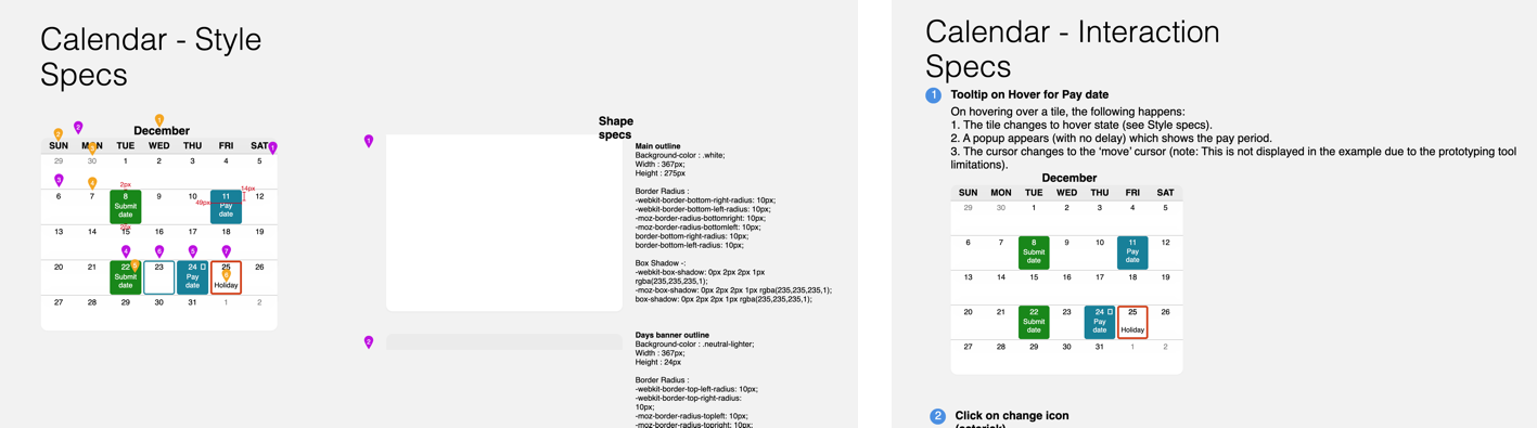
The calendar was very well received by our users, and I recognized the need to make it a reusable component for different part of the product. I produced detailed visual and interaction specifications for the calendar component using Sketch, Zeplin & Axure - covering everything from icon, font and shape specs to interactions on hover, click and drag/drop.
As a designer, it is crucial to have a strong line of communication and collaboration with stakeholders to get them aligned for implementation of the designs.