Keeping It Reel is a data visualization web app which allows users to explore and analyze inter/intra sex ratios and conversational themes in movie dialogues from 600+ movies spanning 9 decades and various genres. The goal of the visualization is to allow movie linguists/analysts and movie buffs alike to understand what characters in their favorite movies are talking about. We derived further attributes in the dataset through a range of data analysis methods, brainstormed and iterated different ways to visualize the information, designed the visuals and interactions for the final visualization and implemented it using D3.js.
This project was highly appreciated by the faculty and chosen by the professor as one of the best projects in the class for the semester. A lot of people appreciated the visualization and had a lot of fun playing around with it and exploring their favorite movies.
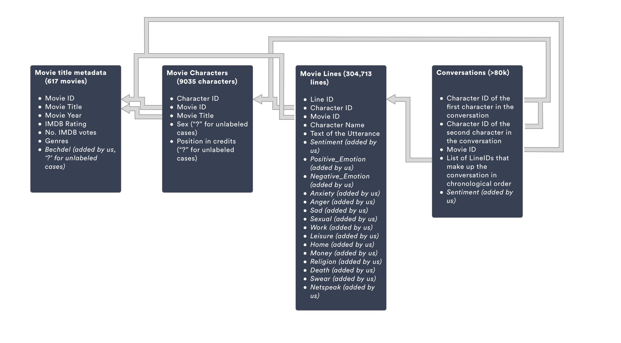
For our dataset we used Cornell Movie Dialogs Corpus, released along with the paper Chameleons in Imagined Conversations: A new Approach to Understanding Coordination of Linguistic Style in Dialogs by Cristian Danescu-Niculescu-Mizil and Lillian Lee. It contains multiple files which provide a metadata-rich collection of movie conversations extracted from raw movie scripts. It covers 220,579 conversational exchanges between 10,292 pairs of movie characters. It involves 9,035 characters from 617 movies. There are in total 304,713 utterances.
Note: Raw publicly available scripts were matched with the IMDB database, those with less than 5 IMDB votes were discarded, pairs of characters that interacted and had more than 5 conversational exchanges were identified to compile the final list of conversations.
Movie critics and linguists who are interested in understanding what movies are talking about and how different trends are changing for time and across genres - eg: Netflix analysts.
Movie buffs or anyone who likes movies and is interested in knowing more about what the characters in their favorite movie typically talk about.
Explore dialogue content
How do conversation themes and genres intersect? In a specific movie, how do themes intersect with characters? What are the patterns of conversations between characters?
Gain insight into intra and inter sex ratio & balances
How does inter & intra sex ratio in conversations vary over years and themes? Do certain genres have a better female-female balance in conversations? How do these ratios intersect with movies that pass or fail the Bechdel test?>
We discussed the different analytical questions that could be asked and the different approaches we could take to fulfill our user goals. Based on that, we came up with 2 multi-coordinate (composite views consisting of different parts which interact with one another) views and 2 innovative (a single view with multiple elements) views.
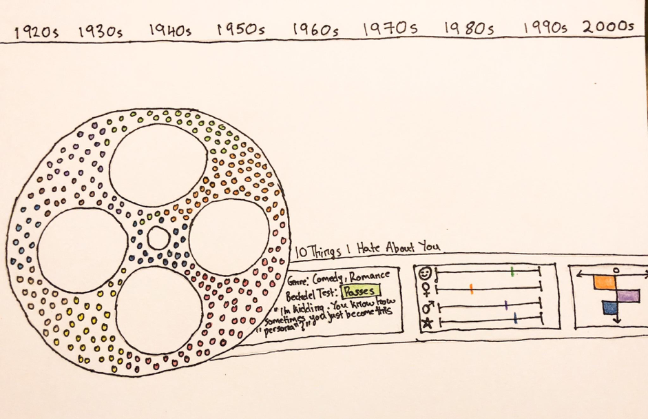
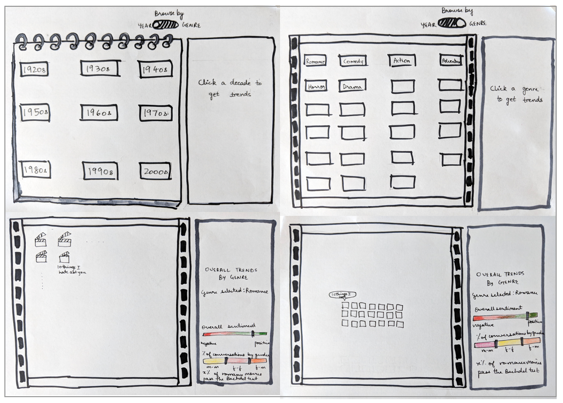
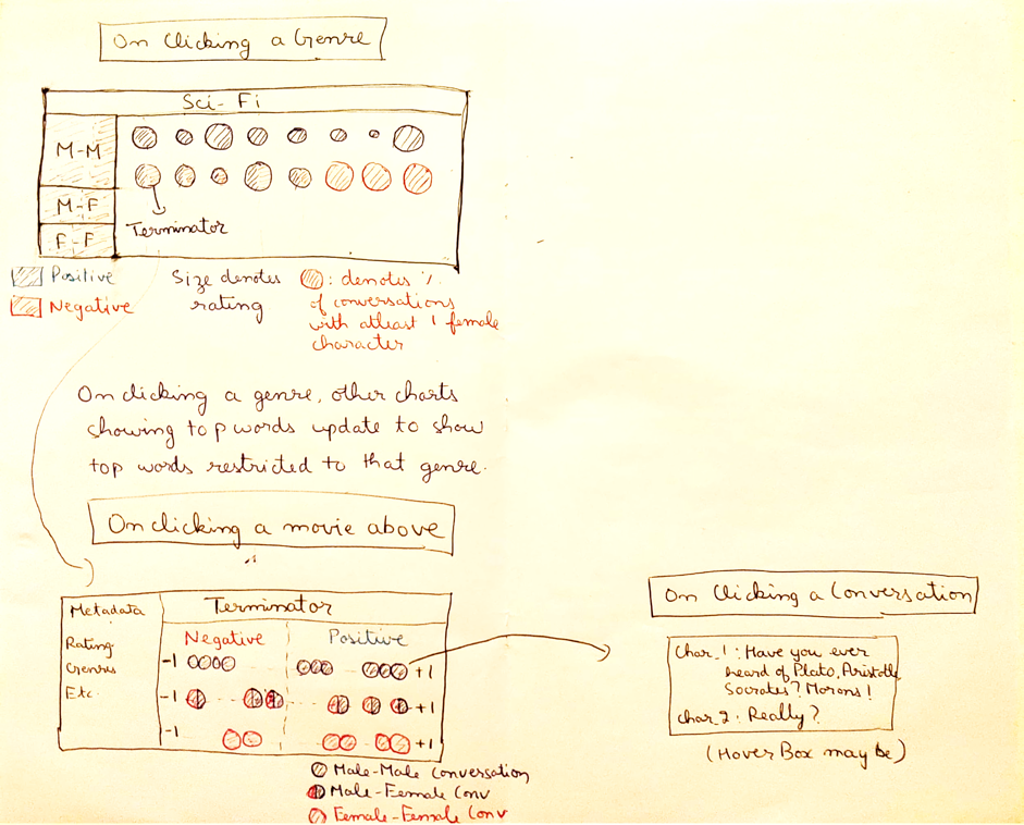
This design idea uses a movie reel visual to highlight details about each specific movie. The reel itself would be a density pixel of every movie, colored by year or genre or filtered to the decade by clicking on the top bar. If you select a movie, in the film strip, you would get to see details on that movie such as the genre, year, if it passed the Bechdel test, the overall sentiment of the movie and the ‘theme/categories’ of the movie.
This idea gives the users the option of drilling down by genre or by decade in a fun, whimsical way - like a calendar or movie board. Once they select any of these categories, we would then have maybe a dense pixel mapping of movie titles filtered to that genre/decade with the overall sentiment and sex ratio balance trends for that specific genre/decade in the side panel.
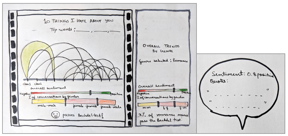
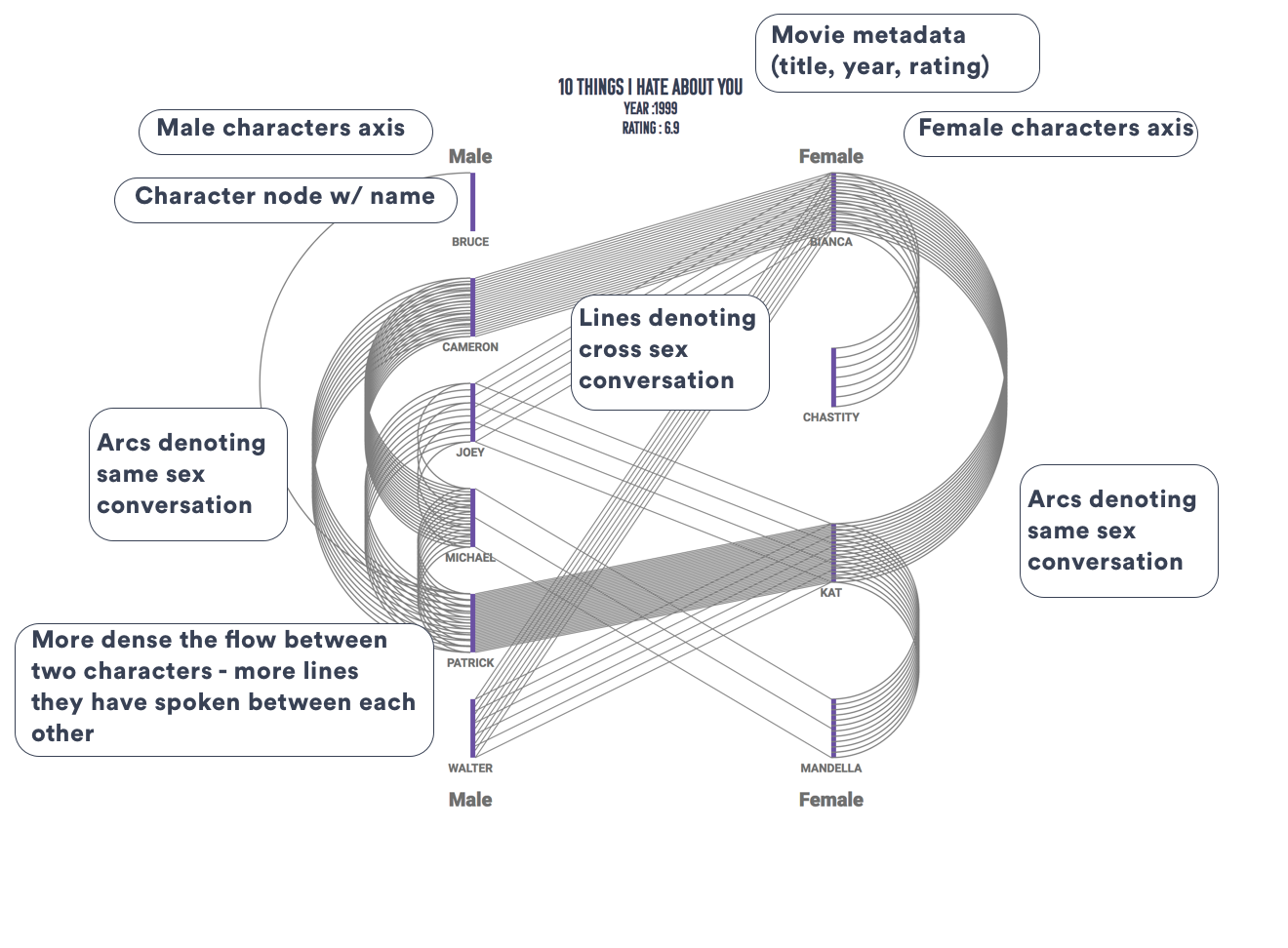
In the detail view, we have the conversation mapping between different characters in the movie, in the form of an arc diagram, with each node representing a character in the film. Hovering over an arc would or clicking on it would give us more information about the conversation in the form of a popup. Here, we also have sentiment and sex ratio balance trends for the specific movie to compare to the overall trends.
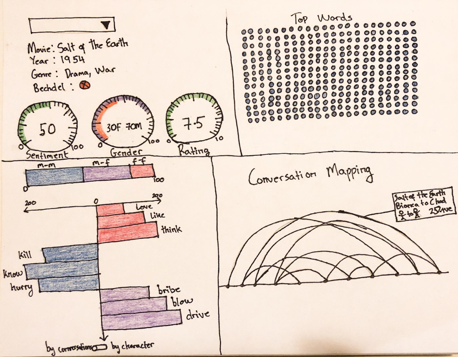
In this design, the user could select a movie and they would see details about it like the sentiment, sex balance ratios, IMDB ratings (dials in the top left quadrant), bar charts to show words/themes by sex (bottom left quadrant), arc diagram to show conversation mapping with each character as a node (bottom right quadrant) and a density pixel of top words used (top right quadrant).
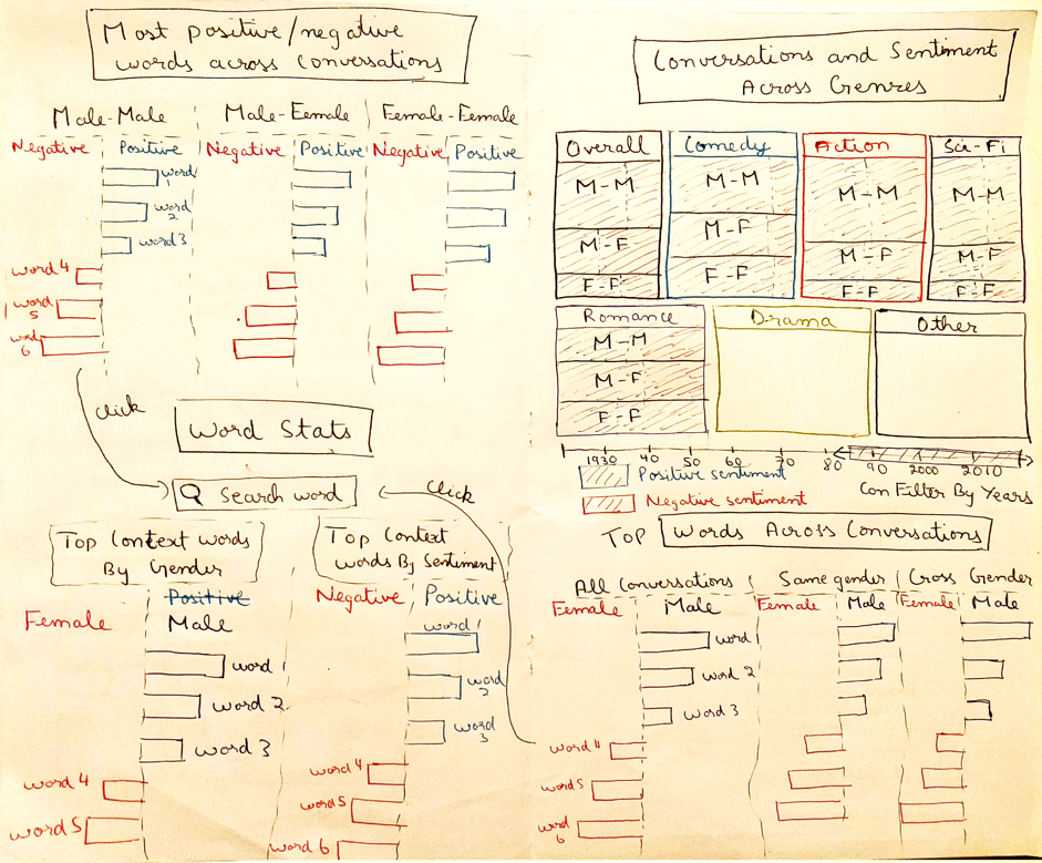
This was a highly analytical visualization, which allowed users to see cross sex, word, sentiment and ratings trends through treemaps, bar charts and stacked area charts. The user could also drill down from high-level trends across genre and time, to details about individual movies. The rest of the viz mostly focused on the top words in different categories - positive/negative sentiment, same-sex/cross-sex conversations, context and so on.
We had a poster session where we collected feedback from our classmates as well as experts on various aspects such as what they are interested in seeing with the data (to evaluate which direction we should go in), which visualization appealed to them the most (in terms of visualization and functionality) and usability.
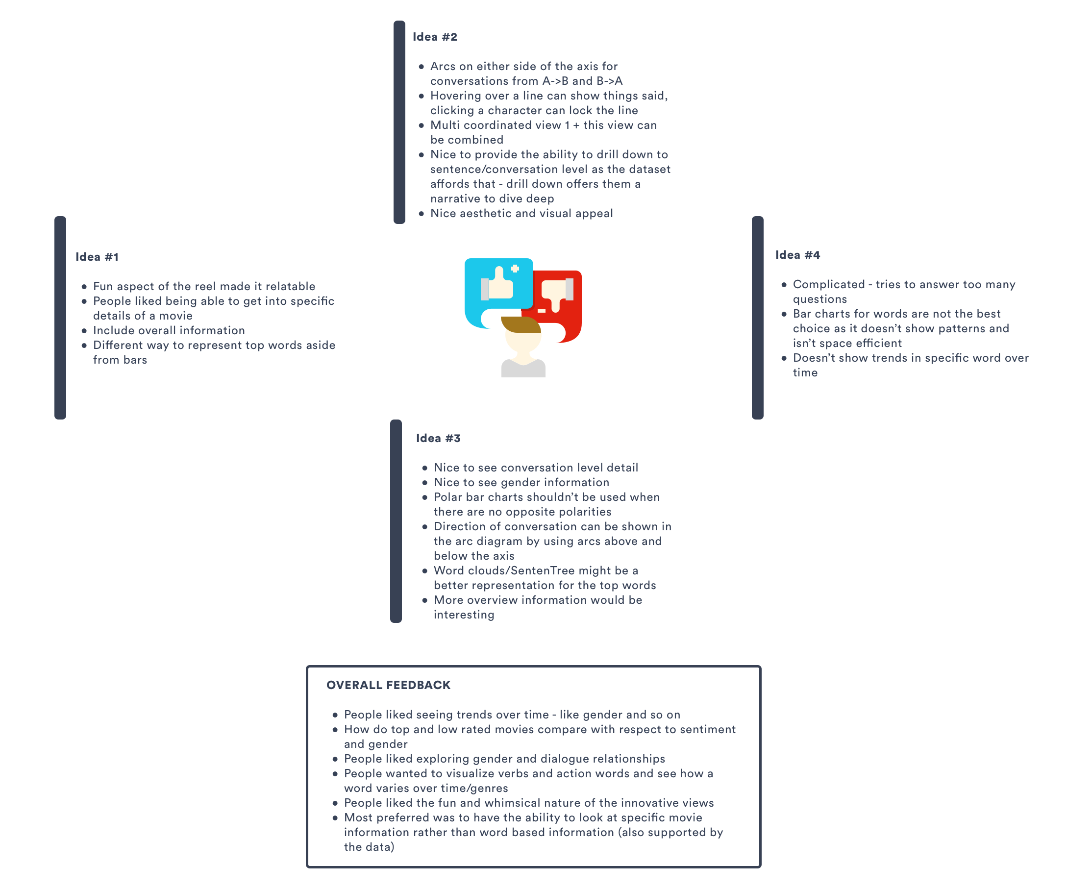
Based on overall feedback, we went with an overview and detail view as people were interested in discovering high level patterns and then drilling down to a specific movie.
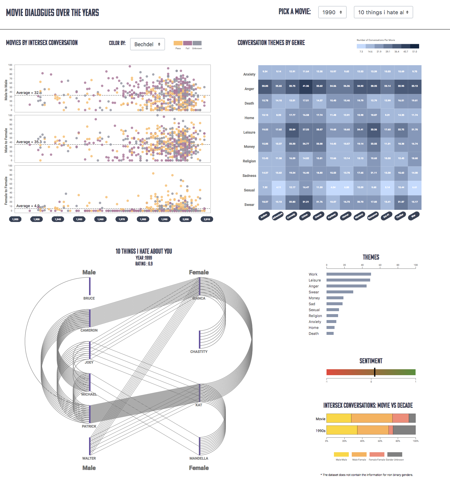
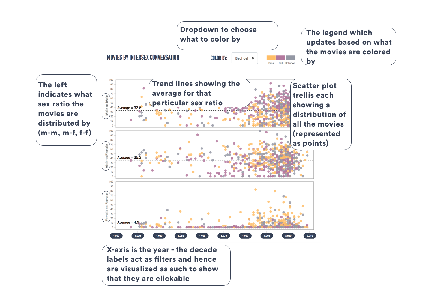
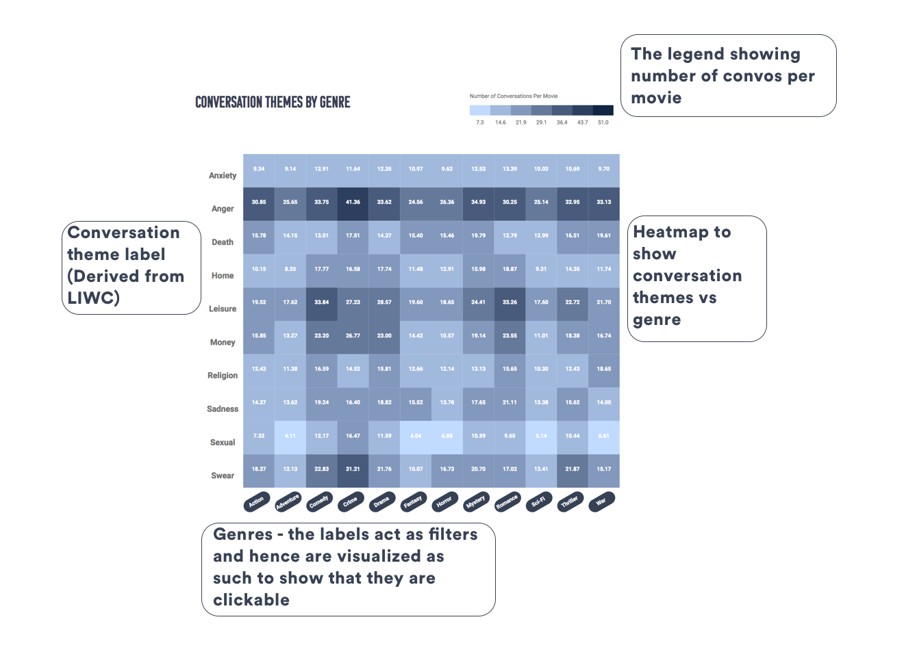
Overview view has overall trends through a dense pixel mapping of all the movies across sentiment, bucketed by decade, and shaded by whether they pass the Bechdel test or not. It also has along with a bar graph of top themes across decades.
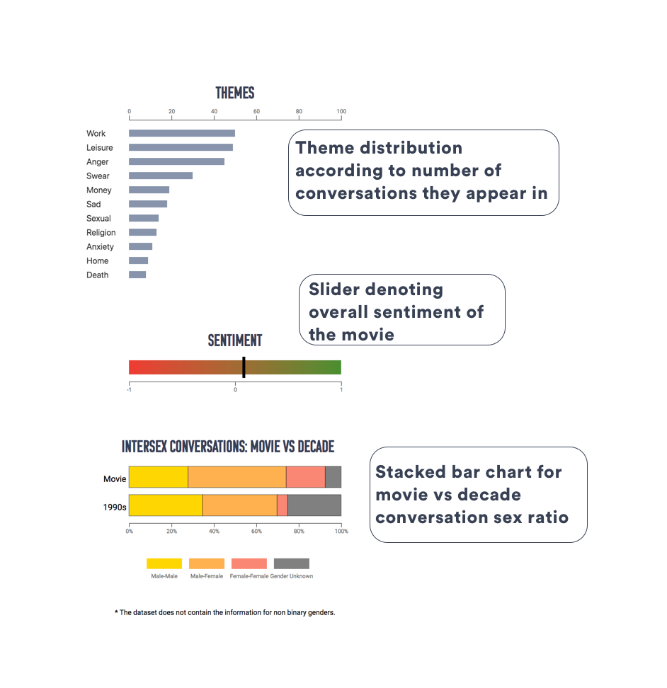
The detail view, once a user chooses a movie, has a network diagram of conversations through a hybrid between a parallel coordinate and an arc diagram. This has two axes for male and female characters, with arcs between nodes on the same axes representing same sex conversations and lines between the two representing cross sex ones. The view also has sliders for sentiment and bars to indicate sex balance for that movie vs the decade it was released in, as well as top themes shown through bubbles.
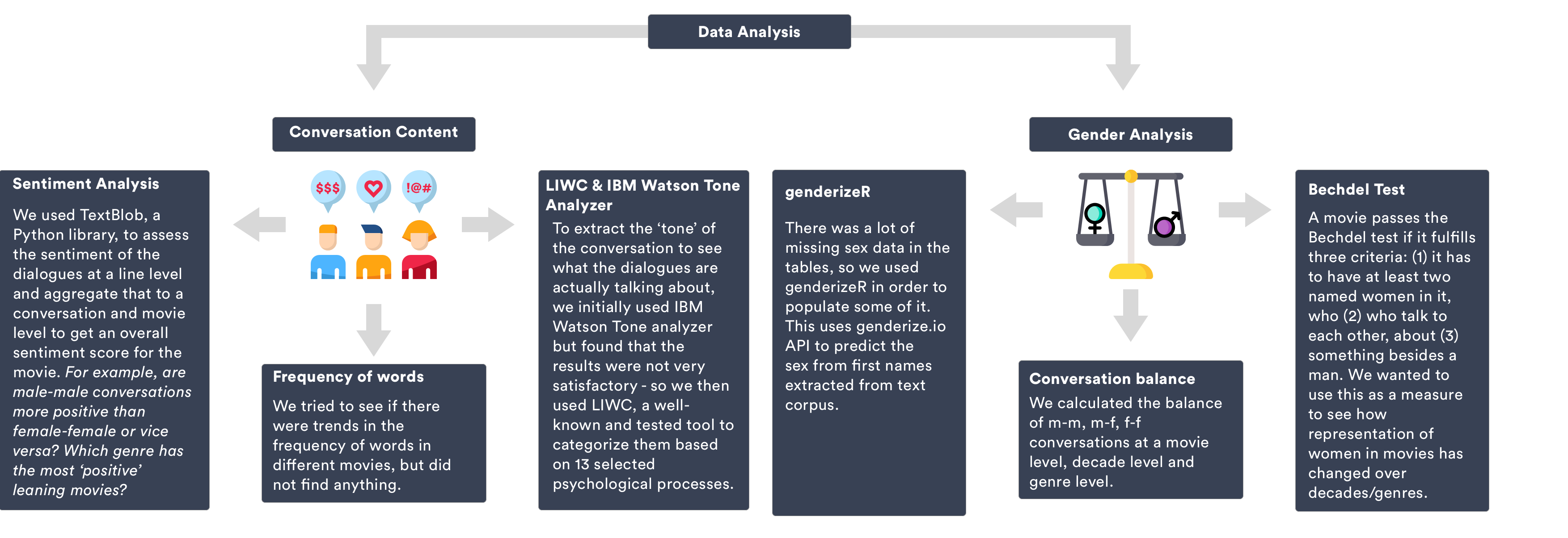
Based on further data analysis, we found no interesting pattern for the sentiment, and found that the sex balances in the conversations over the decades were more interesting. Further, themes were unchanging across decades - so we did not see the value in showing that, rather we showed the conversational themes obtained from LIWC across genres. For the detail view, as we implemented it we made some design changes - the theme bubbles made it difficult to distinguish the value for each theme so we opted for bars instead, and placed the stacked bar charts next to one another for easy comparison.
We wanted a fun, modern, sans serif font as our visualization was built to be fun & engaging for the users. We went with Komu.

Selection of decade highlights those movies in the scatter plot and modifies the themes-genres heat-map to reflect the values for the movies in that selected decade
Selection of parameter to color by - the movies in the scatter plot could be colored by different measures, like Bechdel test, or various conversational themes.
Brush and link - Since the scatter plot showed all the movies distributed by percentage of male-male, male-female, female-female conversations, we wanted users to explore how a movie fared across all the three. Hence, brush and link allows the users to select a set of movies with say, high male-male conversations to see how they fare in the female-female conversations.
Selection of genre - Selecting a genre filters to the movies in those genres in the scatterplot.
Select movie/use dropdown - Selecting a movie allows the user to go into the detail view. We had to provide the user an option of a dropdown in addition to selecting from the scatter plot, we took that design decision as navigating through multiple movies would be difficult on the scatter plot. Selecting a movie selected it across all the three scatter plots.
View conversation on hover - Hovering over the arcs highlights it and shows the conversation it represents.
Theme filter - Selecting any of the themes filters the arcs to show only those conversations.
I'd love for you to explore the visualization and discover insights on your own, but here are few of the interesting ones we found (not giving them all away!)