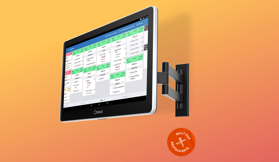
Toast, Inc. is a cloud-based restaurant software company based in Boston, Massachusetts. The company provides a restaurant management and point of sale system built on the Android operating system. I designed easy to use and intuitive experiences for the point of sale and the kitchen display screen, used by servers and kitchen staff respectively; helping them complete complex day to day tasks in the restaurant in a smooth and simple way. I also worked on the web experience for the Toast backend to enable owners/manager to configure their restaurant on Toast.
It's a busy day for a restaurant, the kitchen is slammed with orders during lunch rush when suddenly...
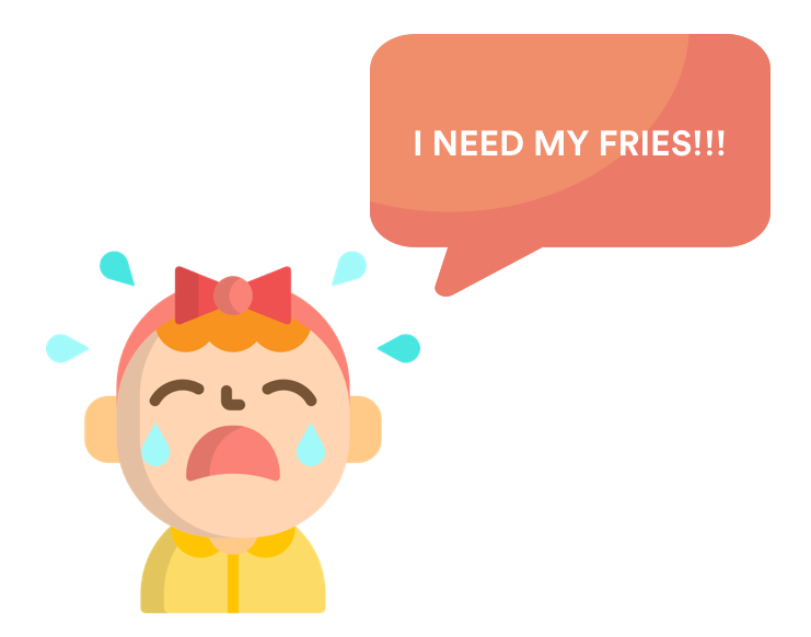
There's a table with a hungry child and flustered parents who need their food ASAP. Or maybe a customer has an emergency and needs their food right away. The kitchen needs to rush the order and move to the front of the line. Take another similar scenario - what if the kitchen needs to sort their orders by course or by table number to improve their efficiency?
In short - how can kitchens reprioritize their tickets as needed to handle rush cases and maximize efficiency?
I researched restaurant needs behind sorting and prioritizing their kitchen orders, which contributed to realigning the product roadmap to match user needs, and designed a way to give them flexibility over their tickets.
Using research insights, I uncovered the user's real needs - which led to a pivot in the product roadmap, saving the team's resources in building a feature that was not what the user desired
Using my engineering background, I understood technical limitations and worked closely with the engineering team to product designs within those constraints
1 product designer/researcher (me!) + 1 product manager + 1 engineering lead
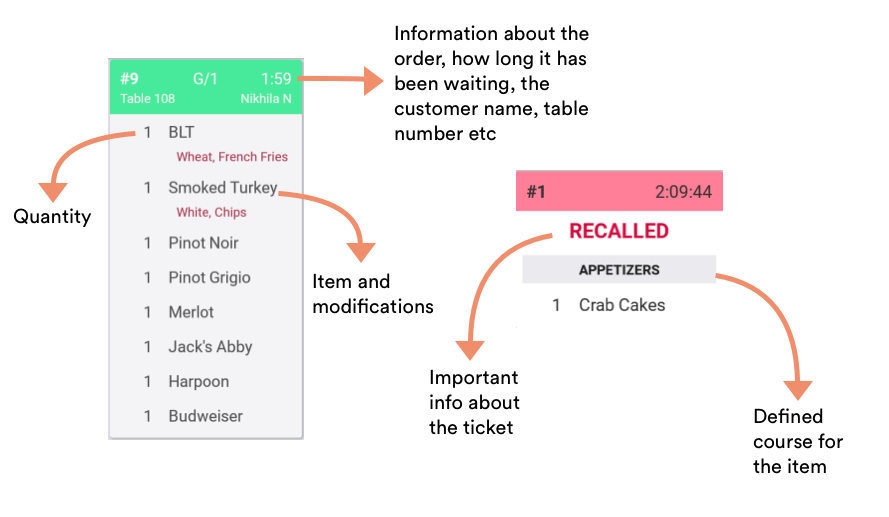
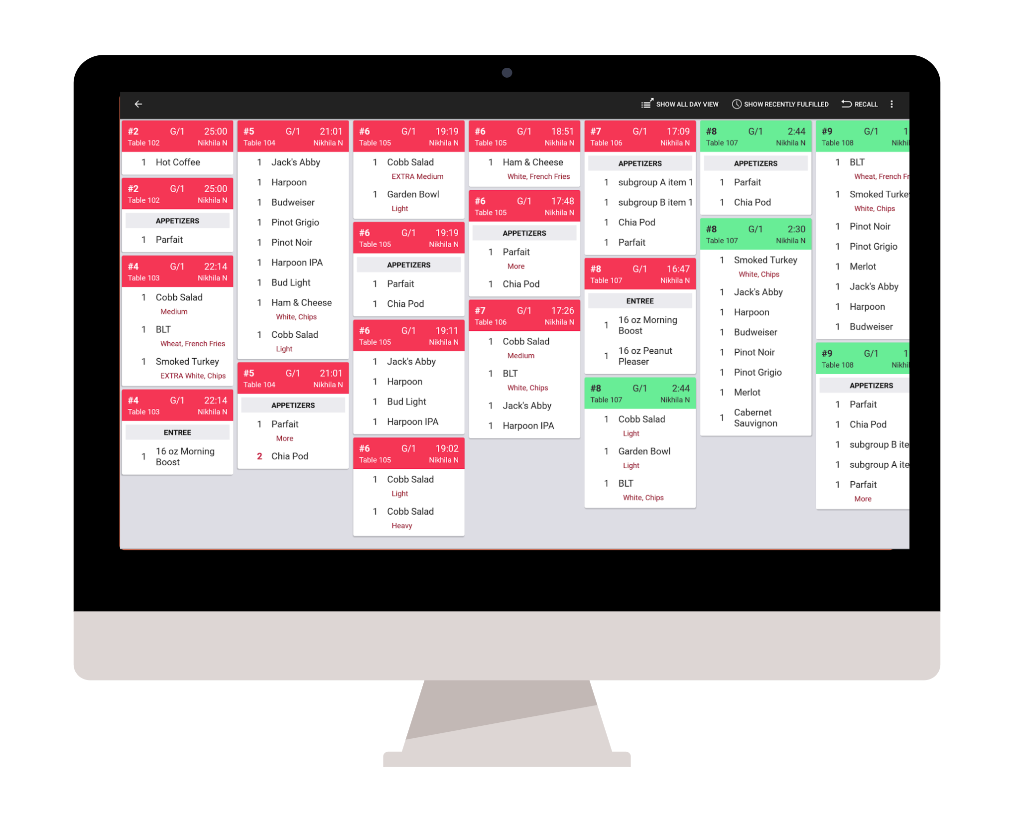
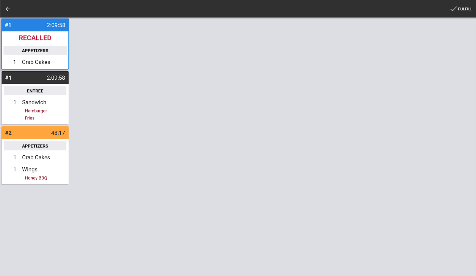
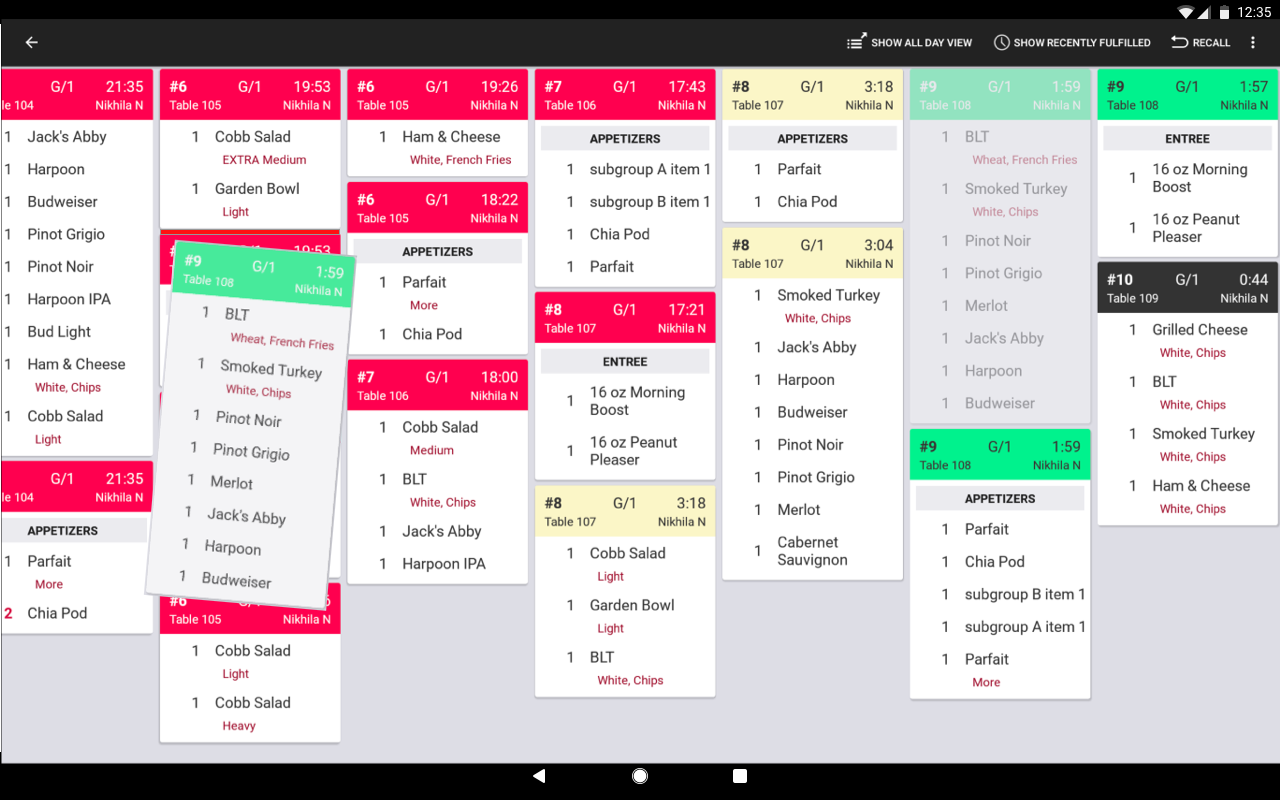
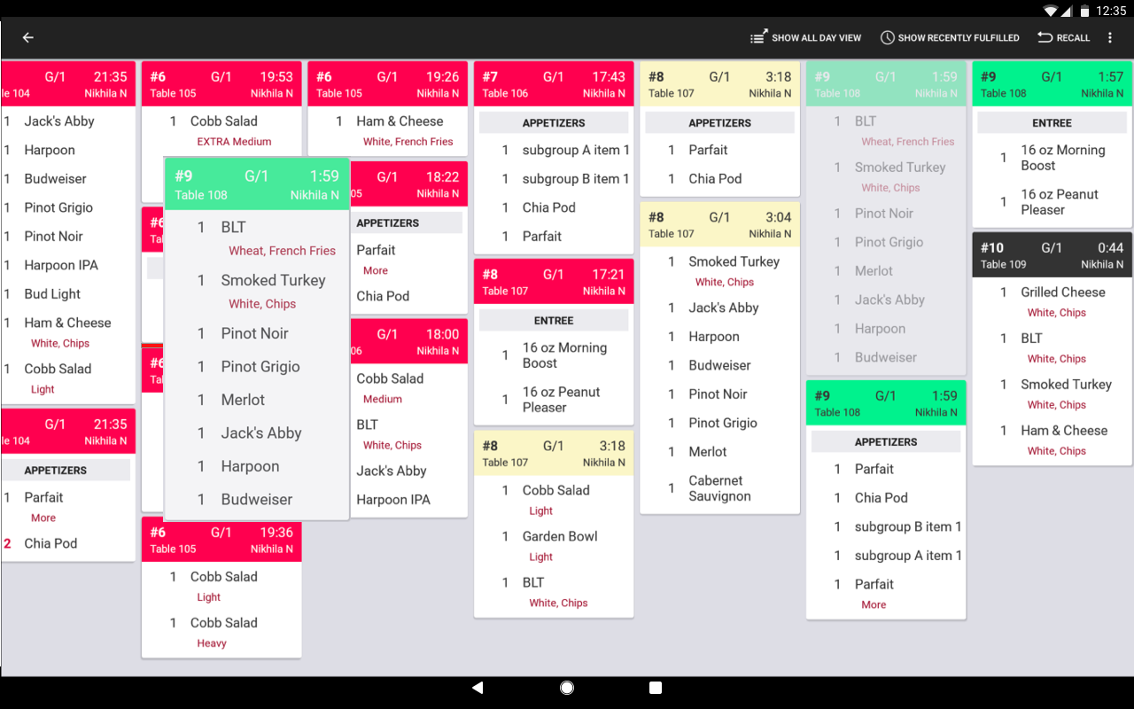
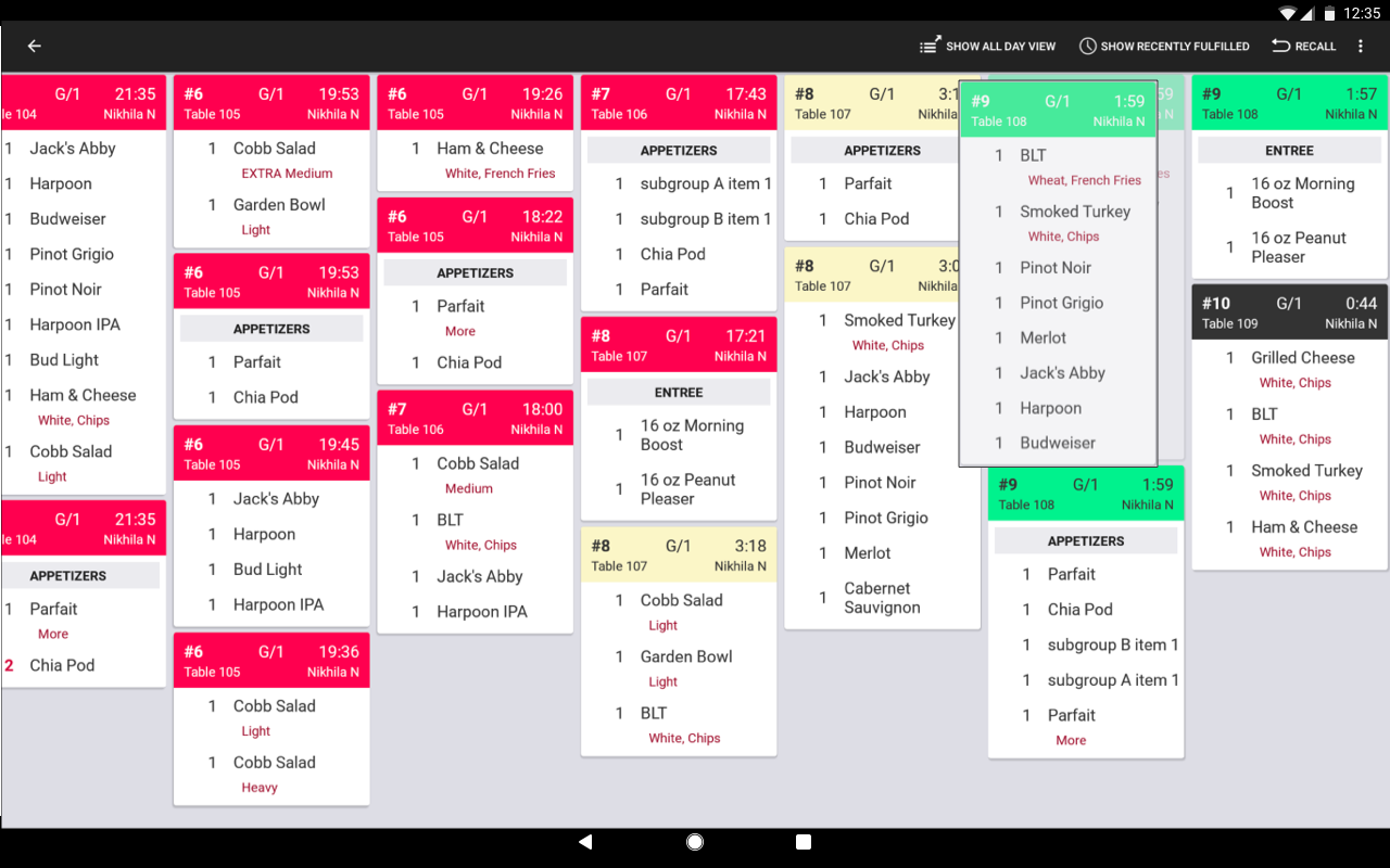
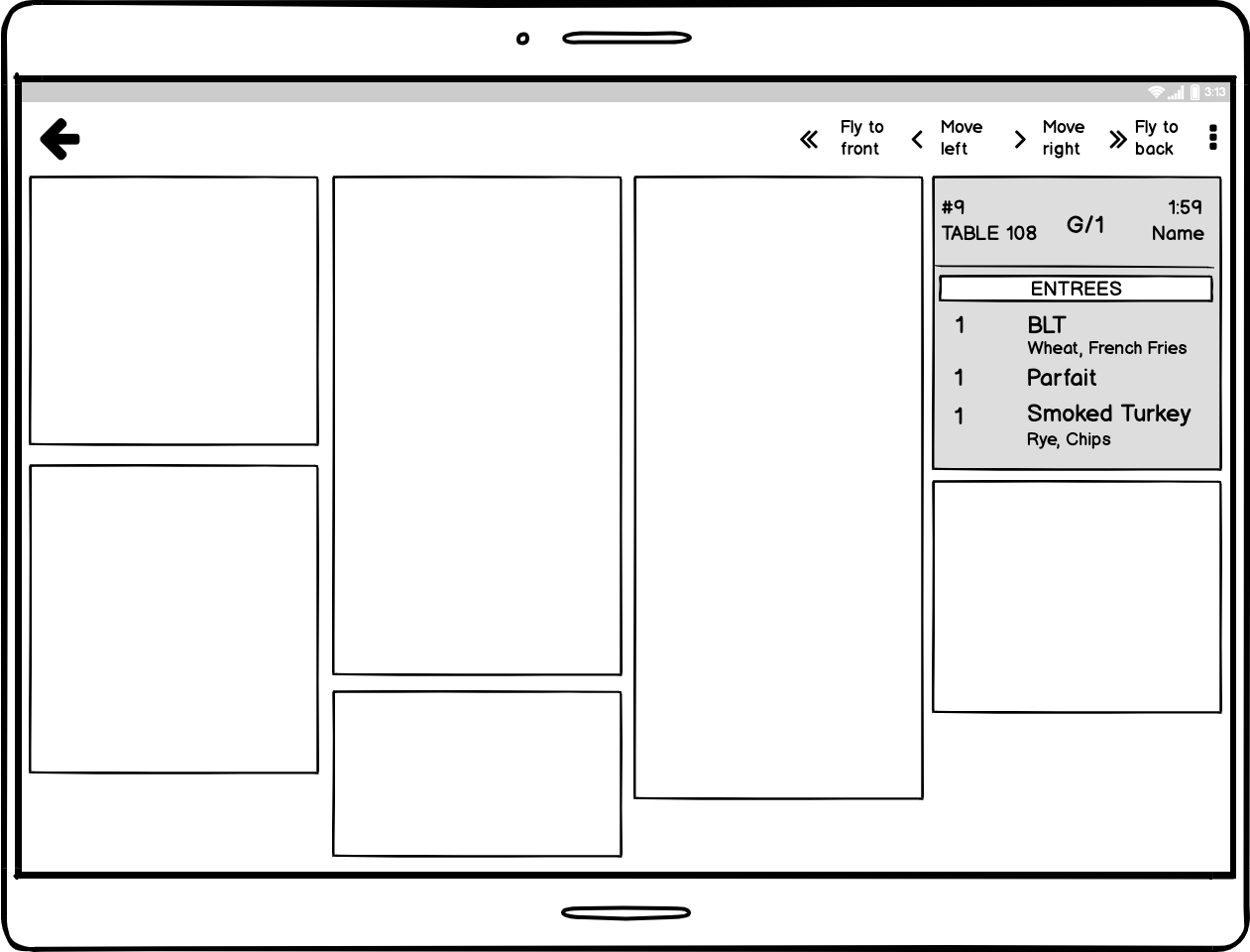
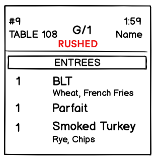
Each box is a 'ticket', representing an order that has been rung in from the point of sale - by oldest to newest. The colour and information on the header of the ticket can be configured - typically restaurants configure the colour to change depending on how long a ticket has been waiting - green at first, then orange and red as the wait progresses.
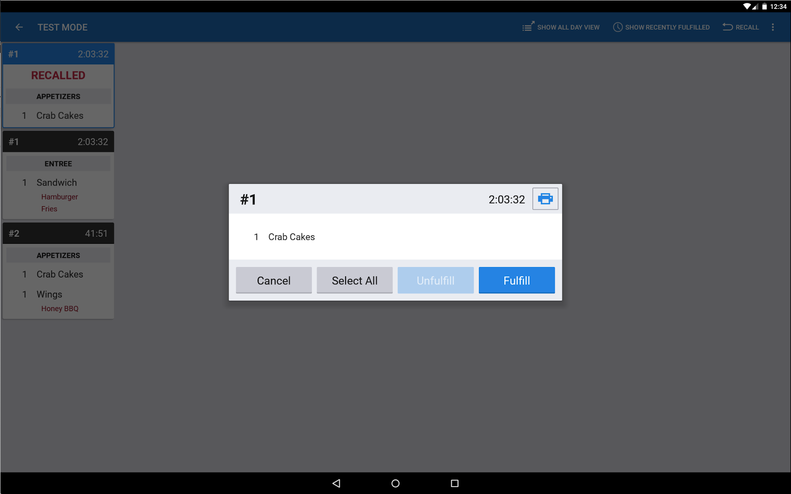
Based on different configurations for the kitchen system, there are different workflows to mark an order as ‘done’/fulfilled once the kitchen staff has finished preparing it and it is ready for the customer. Spoiler alert: This info is relevant later on!
The two feature requests customers put in were related, so I combined the research for them to save the team's time and resources.
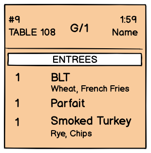
Marking an order on the kitchen display screen as a ‘rush’ or urgent order
Arranging orders according to table number, courses, dine-in/takeout and other factors
Going through 90 feature requests in Salesforce which detailed the problem, desired workflow, and current workarounds in place
Explored the user manuals, and demos of 9 KDS systems to find rush/sort features offered by 5 of them
Interviews conducted with 6 restaurant owners/managers to learn what they are looking for when they talk about sorting kitchen tickets, and also about expected behavior when a kitchen ticket is marked as a "rush" order, and if there is any overlap with requests between the two features.
—Bird’s, Durango CO
—Eggroll Cafe, Lowell MA
I built a flow for how dragging and dropping tickets might work on the Android tablet application.
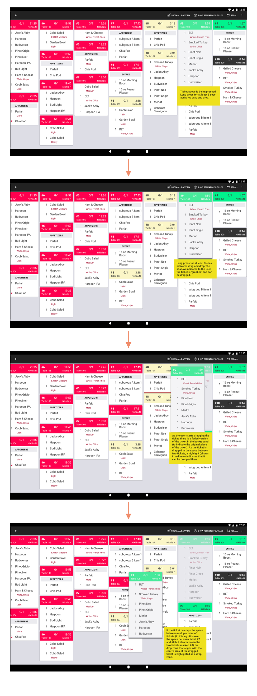
I played around signifiers and feedback to clearly indicate the drag and drop interaction. The additional challenge was designing for a touch tablet surface and not desktop. I looked at apps like Google Keep, and non visual signifiers like haptic feedback.
The engineering team worked on building a quick proof of concept to check the feasibility, and I along with the team evaluated the technical feasibility of the feature.
Action is visible and immediate
Mimics real life interaction
It is not accessible
Technically challenging
Imperfect & imprecise
Re-rendering the screen each time was a huge computational load
Given the large number of tickets, there would be a long horizontal scroll on the screen
Given the problems with this, I rephrased the problem.
Instead of drag and drop, I designed dialogs and actions to move tickets in a more controlled way. This supported the most common use cases customers had - for example: rushing a ticket to the front of the screen and other specific use cases.
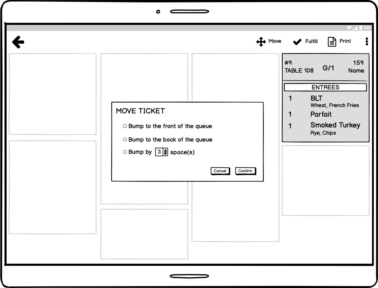
If a ticket moved, it had to indicate the change to other users looking at the KDS at the same time. Based on user research, I came up with these alternatives.
Presented the wireframe flow to engineering lead & product management as a feasible direction we could go in. They loved it!
Unfortunately due to the restaurant industry being severely hit by COVID-19 and the resultant change in priorities in the product roadmap, I had to pause the project here. I documented all the insights and designs to be picked by later by the team.